
In a recent post, I introduced an interactive dashboard that explores the relationship between party control of state government and a variety of well-being metrics at the state level. Of the seven metrics included in the dashboard, states with more years of Democratic control were associated with better outcomes on four of the metrics (Median Household Income*, Uninsured Rate†, Bachelor’s Degree + Rate**, and GDP Per Capita†), while there wasn’t a statistically significant relationship for the other three metrics. However, the dashboard doesn’t show just how much these relationships change over the 20 years the dataset spans (1999-2018).
A Tool for Understanding the Relationship
To explore this dynamic, I introduce a dashboard examining how the relationship between political party control of a state’s government and the following well-being metrics has evolved over the last 20 years:
- Median Household Income
- Poverty Rate
- Uninsured Rate
- No High School Diploma Rate
- Post-Secondary Education Rate (Bachelor’s Degree +)
- Gross Domestic Product (GDP) Per Capita
- Unemployment Rate
The dashboard classifies each state’s government in a given year into one of three categories – Democratic-controlled, Republican-controlled, or split government control. A state is only considered to be under either Democratic or Republican control if that party controls all three primary components of the state’s government – the governorship, the state house, and the state senate – also known as a “trifecta.” If the state has any combination of political party control other than a trifecta, it is placed in the split government category for that year.
The dashboard shows the average performance of all states within each of the party control categories over the last 20 years, with the dropdown on the right toggling between metrics. Note that for some of the metrics, lower numbers are better (e.g. Uninsured Rate), while for other metrics, higher numbers are better (e.g. GDP Per Capita).
What the Dashboard Can Tell Us
The dashboard illustrates the growing divide between “red states” and “blue states” over the last 20 years. While Republican-controlled states have stronger average performance on four of the seven metrics at the beginning of the timeframe, Democratic-controlled states have stronger average performance on six of the seven metrics by the end of the timeframe. The unemployment rate is the only metric in which Republican-controlled states have stronger average performance by the end of the 20-year period.
Three metrics flip from having stronger average performance among Republican-controlled states at the beginning of the timeframe to having stronger average performance among Democratic-controlled states by the end of the timeframe – Poverty Rate, No High School Diploma Rate, and Post-Secondary Education Rate (Bachelor’s Degree +).
For example, in 1999, Republican-controlled states were outperforming Democratic-controlled states on the poverty rate by 1.1 percentage points. However, by 2018, Democratic-controlled states were outperforming Republican-controlled states on average by 2.8 percentage points, a 3.9 percentage point swing.
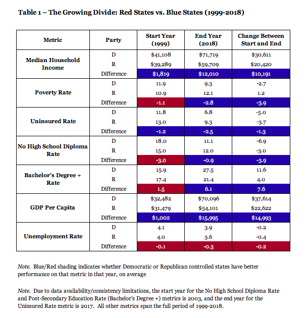
In addition, there were three other metrics in which the gap between Democratic and Republican-controlled states widened even further over the course of the timeframe – Median Household Income, Uninsured Rate, and GDP Per Capita. For example, in 1999, Democratic-controlled states had higher median household incomes on average by a margin of $1,819. However, by 2018, the gap was up to $12,010, an increase of over $10,000.
Limitations and Future Analysis
To be sure, this dashboard is not intended to imply a causal effect; correlation is not causation. Democratic policies may have driven stronger median household income performance amongst Democratic-controlled states, but it’s also possible that wealthier states started to elect more Democrats. Further, since the states comprising each category can change from year to year, there’s no way to draw any conclusions about a potential causal relationship based on what we see here.
In a future post, I will start to dig into whether any such causal relationships exist. I will analyze how each of these metrics evolves over the course of trifecta control by either party, and compare it to how those metrics evolve in states that aren’t under trifecta control by that party. In other words, I’ll seek to isolate the effect that party control of state government has on these various well-being metrics.
† indicates significance at p < 0.1
* indicates significance at p < 0.5
** indicates significance at p < 0.01
Note: Edited on June 10, 2020 to provide more detail on statistical significance.
You can find the data and code used in this analysis here.